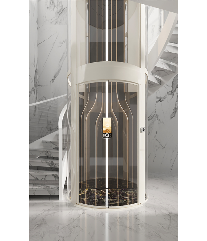
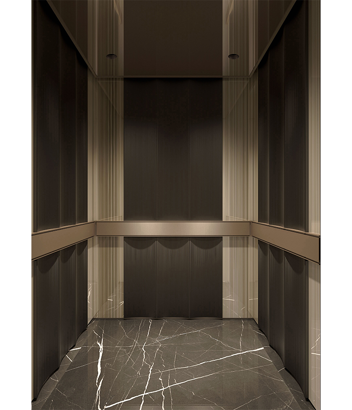
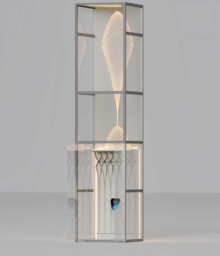
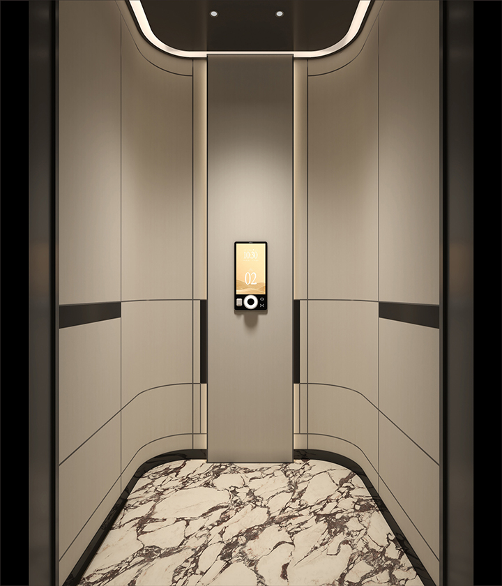
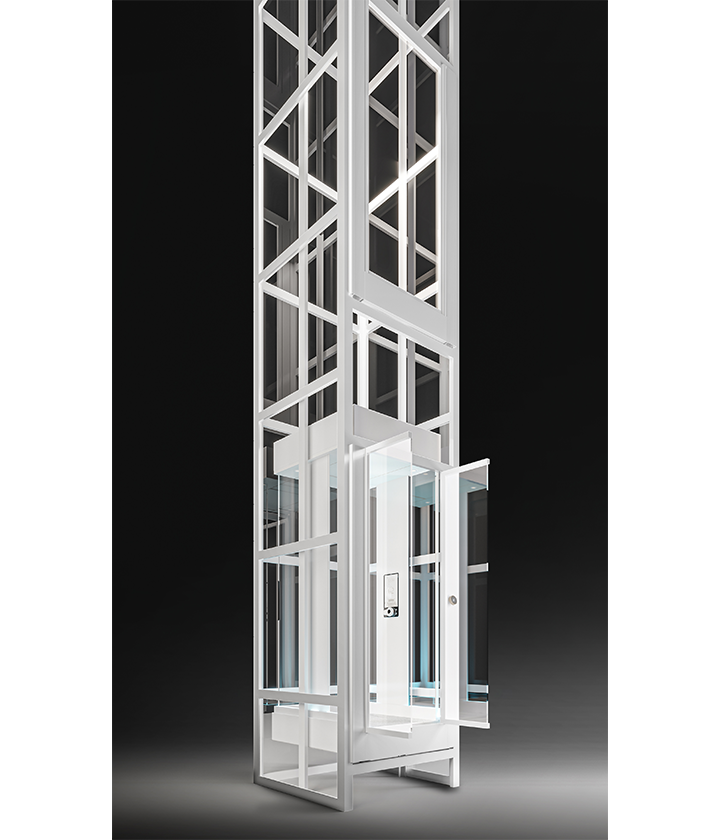
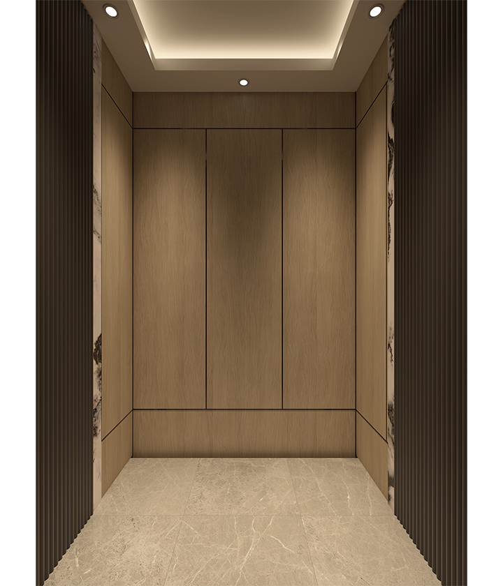
This is a work from 1886 by an architect who proposed the design concept of "less is more', which only highlights the modernist temperament in the space through thetexture of the material itself and the subtle proportion of one’ s own understanding.
We attempt to break the order of pace through the comnection of the lines and the change of the wa skirt proportions in the symmetric space of the elevator and then overlap textured materials to produce a space that can more cater to modern aesthetic preferences.
Read More

 English
 Русский
 Español
 عربي
عربي ไทย
ไทย
